As we attempt to figure it out, I aim to still make people feel welcome in this disheveled space. So, I decided to make a sign that will greet people when they first walk through the door. greet them with a hello.
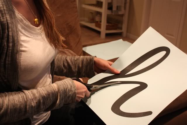
My first step was to pick a font that would translate well into a wooden sign; one that didn't have too many small cutouts. I chose the font Black Jack. Then I got each letter enlarged - you can do this at any local copy shop. Then I cut out each letter.
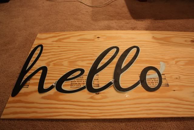
After they were all cut out, I taped them together and traced them onto my piece of wood. As you can see, I modified my font a bit. Truth be told, I wanted to free-hand it, but I knew it just wouldn't look as clean. But I did want the 'o' to look like the way I make my cursive 'o'. Hence, the modification.
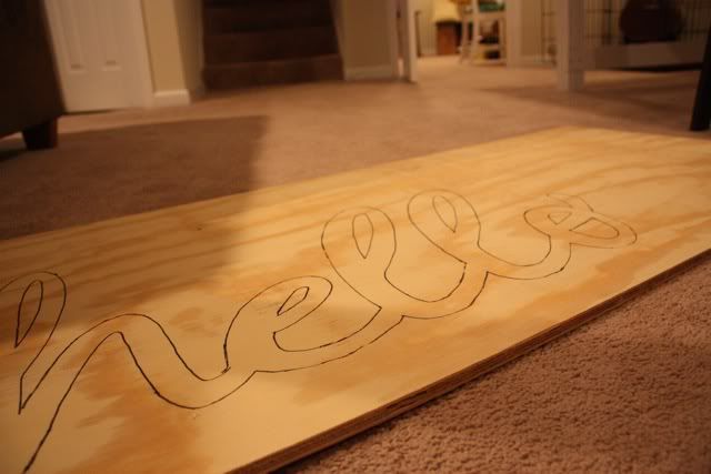
This next step requires someone handy, unless you're allowed to use power tools, which Josh has informed me, I am not.
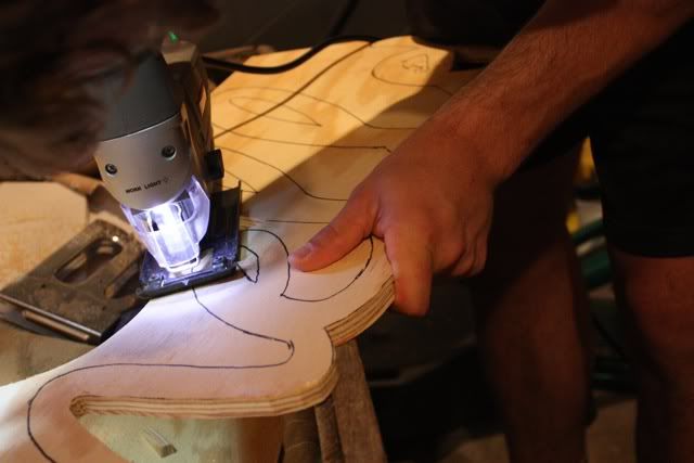
We (and when I say we, I mean Josh) cut out the letters using a jigsaw. Then he sanded the edges and the places where the jigsaw had made a couple digs.
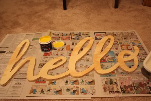
Next was painting. I wanted a cheerful, inviting color, so of course I chose yellow. Happy day for me when I realized that I had picked yellow when ordering my free valspar paint sample. Dijon to be exact.
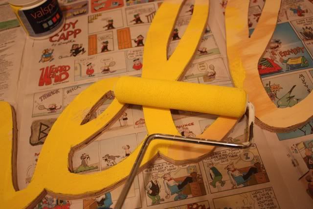
After a couple coats and some questioning remarks from Josh, I added some brown to tone it down and make it a more mustardy yellow.
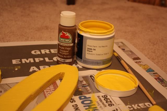
And here is the finished product:
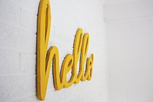
i love the bright yellow against the white brick wall. and it definitely makes me smile when I walk in the door.
more to come on the progress/styling of this room...
This project has been linked to:

thats awesome! looks great!
ReplyDeleteok THAT is cool! Love the color..
ReplyDeleteTana
Thanks for the kind words. :)
ReplyDeleteHey cool girl! I found your blog through the Remodelaholic. I loved your table, and your Hello sign is pretty sweet. Just wanted to let you know. :) I'm a new follower too.
ReplyDeleteHi Shelby!
ReplyDeleteFound you on Remodelaholic ... love your stuff! I just built a table that I put on my blog, too ... but yours is way cooler!
Great job!
I'm a new follower!
~Bec @ littlelucylu
Love this! very welcoming :-)
ReplyDeleteLove this:) I chose orange for my free valspar paint sample...seemed cool at the time. Not sure what I'm going to do with it:)
ReplyDeleteShelby, this really looks awesome! I love the idea and the final product!
ReplyDeleteCheryl, orange is a great color! I'm sure you'll find something awesome to paint!
ReplyDeleteI love how it turned out! Looks like something out of a magazine.
ReplyDeleteSuch a fun sign. I could see it on a wreath hanging on my front door. You ought to consider selling them.
ReplyDeletelove love love this!!!
ReplyDeleteWow this is great. Like you, I love the colors. A great alternative to 'welcome'. I found you on The 36th Avenue's Let's Party # 5 list. Creative people inspire me and this project is an example so I decided to follow you to see what else you will do. I hope you will follow me back http://talesfrommyjournal.blogspot.com I can be found in facebook too http://www.facebook.com/DeniseMartin.LillaRose and twitter @DeniseLillaRose If you like/follow me there I will do the same for you. When you stop by my blog, please check out my kind of fashion (hair jewelry).
ReplyDeletesooo cute!
ReplyDeleteAwesome! I love it! Great color - I love the look of against the white brick too!
ReplyDeleteThis is so cute!!! And the color is awesome, so bright and cheerful.
ReplyDelete